It seems that Adoption UK has a new logo and CI? Or what is the green and blue design? Why where members not consulted - yet again?
Edited 17/02/2021
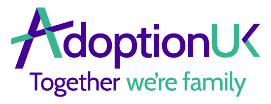
It seems that Adoption UK has a new logo and CI? Or what is the green and blue design? Why where members not consulted - yet again?
One wonders why? Why that is deemed important but all the changes asked for by users - even just those facilities that were lost at the last overhaul and people wanted back - are not
Style over substance!?
Just for the record (not that anyone seems to care): it is badly designed. The purple is so dark that the difference between black writing and purple links is hard to see. The logo itself looks disjointed and aggressive. It does not harmonise or illustrate the slogan.
This image design https://www.linkmaker.co.uk/adoptionuk/home looks like a shattered window - not a good association. The green navigation fields are too similar in tonality to the purple background they sometimes stand on. The colours also don't harmonise with linkmaker's colour scheme (particularly their blue) - something they should do since the two share a website now. The "UK" is illegible on the logo on Twitter.
I don't understand why it is so hard for Adoption UK to understand and respect that their users/members want to be consulted. None of the recent surprises were welcomed or received positively. The forum has been destroyed. Why now implement this new CI without consultation? I find this incredibly arrogant
Dear Chestnuttree, Donatella and Safia,
Thanks for your messages above. We’re sorry you don’t like the new brand. We have had an entirely positive response elsewhere, but we knew not everyone would like it.
We’ll take a look at the specific points you make in case there are some easy tweaks we should make. In fact, the darker green was used on websites because the lighter green is not an accessible web colour. We are going through further design improvements to our website in line with the new brand, which will be rolled out over the coming weeks.
The branding had to change because it was no longer right for AUK, given the changes to the organisation over recent years. You can read more about this in our recent blog, which we shared last week: https://www.adoptionuk.org/blog/adoption-uk-is-50
We did run a consultation – but obviously we couldn’t consult everyone. We take all feedback seriously and thanks for using the forum to share your views and feedback.
Best wishes,
Charlotte
I think what it shows is that we are not important. The changes that we asked for still have not been implemented eg why is there still a sad face emoji - doesn't lend itself to a supportive community?? Seems to me that your view will only be taken into account if you are a fully paid up member. These boards used to be a fab source of support and the only ones trying to keep it going are us and yet we get treated quite badly.
Perhaps it's time for us all to go elsewhere. Xx
Hi Windfalls,
Thanks for your reply. We were asked to remove the angry reaction button (which we totally agreed with as it was not compatible with the supportive community we have on the forum.) This piece of work was completed at the beginning of October.
We hope that the sad reaction would be used in empathy with the post being read, but if the consensus from our users is that this is not the case and many would prefer this to be removed, we can certainly ask the developers at Linkmaker to do this.
Any requests as to what reaction buttons our users would like to be implemented onto the forum can be made below.
Thanks and best wishes,
Charlotte
but the sad face isn't being used to show empathy Charlotte as illustrated on this thread - the user who has posted a sad face on safia's post has then posted a thumbs up on your post. Not very supportive or perhaps it is just open to misinterpretation? Either way not a good feature.
I am glad that users like Simon on the other board obviously get a lot out of their membership. However, no amount of paid membership will ever be able to replace what has been lost here. Also don't forget that not everyone is able to afford or need full membership. These boards have been a life line for so many adopters in their darkest hours and it has now gone. Instead of trying to help build these boards back up by engaging with users on things like changes to the boards, you don't and just impose them. This policy has seen this valuable resource being totally destroyed and yet you keep doing it. Has nothing been learnt?
Have to be honest here - I thought the 4th emoji was a walrus! Only just realised they’re hands! So is it a hug .. or attempted strangulation? 🤣🤣
Me too! Or possibly someone in a face mask 😉
That’s definitely a walrus!
Who was consulted and reacted positively? Members and long standing forum users or the general public or whom? I don't like the new CD, because it not a good design. When your logo does not work on Twitter, you have got a problem. Both your designer and your communication officer should know this.
I can see why you wanted to update the CD, but after the recent disaster with the forum, I would have done a consultation with everyone who wanted to be consulted and if that was not possible, I would certainly have included the most active forum users in the consultation.
This topic is read-only. You must log in to reply.